Why we should avoid using pie/donut charts?
In many organizations, it is common to notice an extensive usage of pie and donut charts in executive presentations. These charts are often favored to visually represent the participation of different categories with respect to a total. By displaying data in a circular format, we tend to think that pie and donut charts make it easy to compare various segments at a glance, highlighting the relative sizes of each category. However, this is not completely accurate.
In this article, we will examine the reasons why we should avoid using pie and donut charts for comparisons. We will explore their limitations, discuss alternative chart types, and provide tips on selecting the most effective visualizations to accurately represent your data. By the end, you will have a better understanding of how to choose the right chart type to communicate your message more effectively.
Difficulty in Comparing Angles
One of the primary reasons donut and pie charts should be avoided is that humans struggle to accurately judge angles and areas. Unlike bar/column charts, where the length of the bars can be easily compared, pie and donut charts rely on interpreting the angle or area of each slice. This can lead to significant misinterpretation, especially when the slices are similar in size. If the pie/donut chart is 3D, the complications to perform comparison tend to be even worse. Small differences in data points are not easily distinguishable, making these charts less effective for precise comparisons.
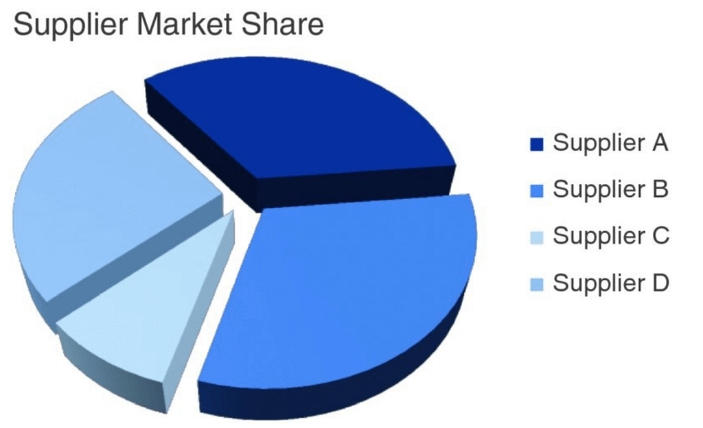
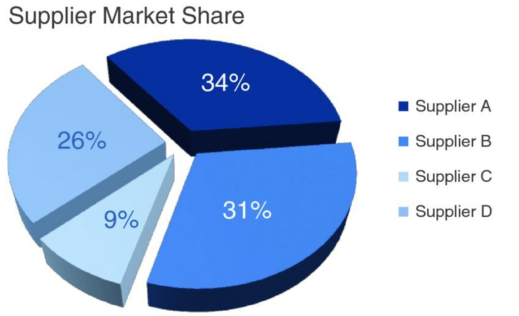
In the example below, taken from the book Storytelling with Data by Cole Nussbaumer Knaflic, we can see that a pie chart is used to compare the market share of four suppliers. By looking at the chart, we could wrongly assume that Supplier B has the largest market share, in part because of the 3D effect, but it is not true. The supplier with the largest participation is Supplier A. This is a common misconception problem when using this type of charts.


Limited Categories and Clutter
Pie and donut charts are only effective when dealing with a small number of categories. When there are too many slices, the chart becomes cluttered and difficult to read. Each additional slice reduces the space available for other slices, leading to a crowded visual that is hard to interpret. This limitation makes pie and donut charts unsuitable for datasets with more than a few categories, where bar charts or other visualizations can display the information more clearly and concisely.
Lack of Precision and Clarity
Pie and donut charts do not provide a precise way to represent data. The absence of a clear scale or grid makes it challenging to gauge the exact value of each slice. For instance, while it is easy to see that one bar is longer than another in a bar chart, it is much harder to judge the size difference between slices in a pie chart. This lack of precision can lead to misunderstandings and misinterpretations of the data being presented.
Misleading Area Perception
People often interpret the area of the slices rather than the angles in pie and donut charts, which can be misleading. Since the human eye is not adept at accurately perceiving area, this can distort the viewer’s understanding of the data. Larger slices may appear disproportionately significant, and smaller slices may be overlooked, regardless of their actual numerical values. This issue can distort the viewer’s perception and lead to incorrect conclusions.
Better Alternatives
There are more effective alternatives to pie and donut charts that can convey the same information more clearly and accurately. Bar charts, for example, are straightforward and allow for easy comparison of different categories. There is even a technical reason called common zero baseline, which explains why bar charts are much better for comparisons than bar/donut charts and that will be explained soon in a different article with more detail.
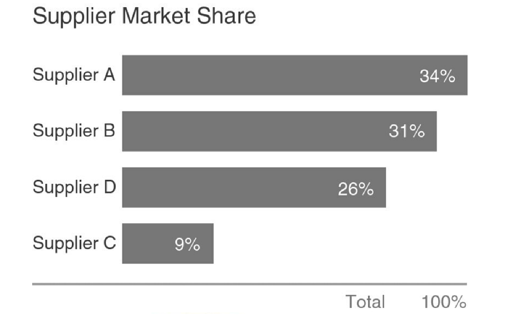
In the example below, taken from the book Storytelling with Data by Cole Nussbaumer Knaflic, we can see that a more effective alternative to represent the market share of four suppliers, represented previously with a bar chart, now using a simple bar chart. Each bar’s length directly corresponds to the data value, providing a clear visual cue, avoiding the need to compare angles of each category.

Other visualization types, such as line charts or scatter plots, can also offer better insights, especially when dealing with complex or detailed data. These alternatives minimize the risk of misinterpretation and provide a more accurate representation of the data.
In conclusion, while pie and donut charts may be visually appealing, their drawbacks in precision, clarity, and ease of interpretation make them less effective for accurate data representation. Opting for alternative chart types can enhance the clarity and accuracy of your data visualizations.

